
Why Dark Fabric Changes the Job
Printing on dark cotton, polycotton, polyester and stretch fabrics asks more from the equipment than light garments do. A bright red or yellow artwork can lose impact fast if the fabric absorbs light through the image, or if the first layer does not block the garment colour well enough. On black tees, navy hoodies, workwear and sports tops, the print has to sit on top of the garment cleanly and cure evenly, otherwise the result looks dull or patchy.
For shops in Johannesburg, Pretoria and the East Rand, this comes up often with school events, clubwear, staff uniforms and limited-run promo orders. Customers usually want strong colour, but they also want a print that lasts through washing, ironing and daily wear. That means the process must be matched to the fabric, not only the artwork.
Build the Colour From the First Layer
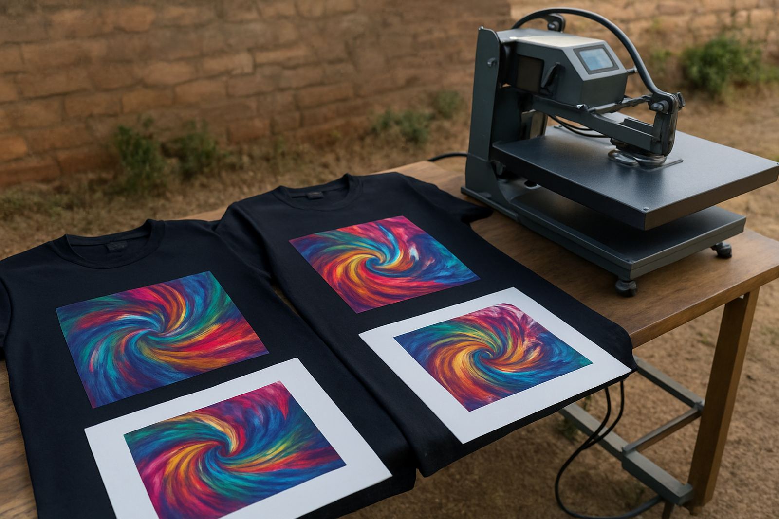
The first layer matters most on dark garments. If you are using a print process that allows an underbase, use it to create an opaque foundation before the colour layers go down. On very dark cotton, a white underbase gives brighter blues, greens and oranges. On some polyester garments, a controlled underbase can also help stop the garment shade from bleeding through.
Good results depend on the balance between coverage and hand feel. Too much underbase can leave the print thick and heavy, especially on fashion tees. Too little and the colour washes out. In practice, a clean underbase with correct choke and trapping gives better edges, less haloing and more consistent colour from shirt to shirt.
- Use a dense first layer for black and navy garments
- Keep the underbase registration tight to avoid white edges
- Test small text, fine lines and skin tones separately
- Check how the print looks under indoor and outdoor light
Choose Media and Consumables That Match the Fabric
Different garment types call for different media and consumables. Cotton usually gives more forgiving results, while polyester and blends can move heat around differently and may need closer control of temperature and dwell time. For transfer work, the media must release cleanly and hold detail without cracking. For direct print workflows, the ink set must bond well to the fibre and stay bright after wash testing.
At CMYK Industries, many production teams ask for help after a job has already shown weakness on dark apparel. In most cases the fix starts with the right media profile, the correct cure settings and sensible expectations for the fabric. A hoodie for winter wear is not the same as a lightweight campaign tee, and a label print is not the same as a chest logo on a polycotton golf shirt.
- Match media to the garment fibre and stretch level
- Check wash resistance before taking a repeat order
- Keep spare transfer media in dry storage, away from damp coastal air
- Review curing and pressing settings after every material change
Heat, Pressure and Curing Need Tight Control
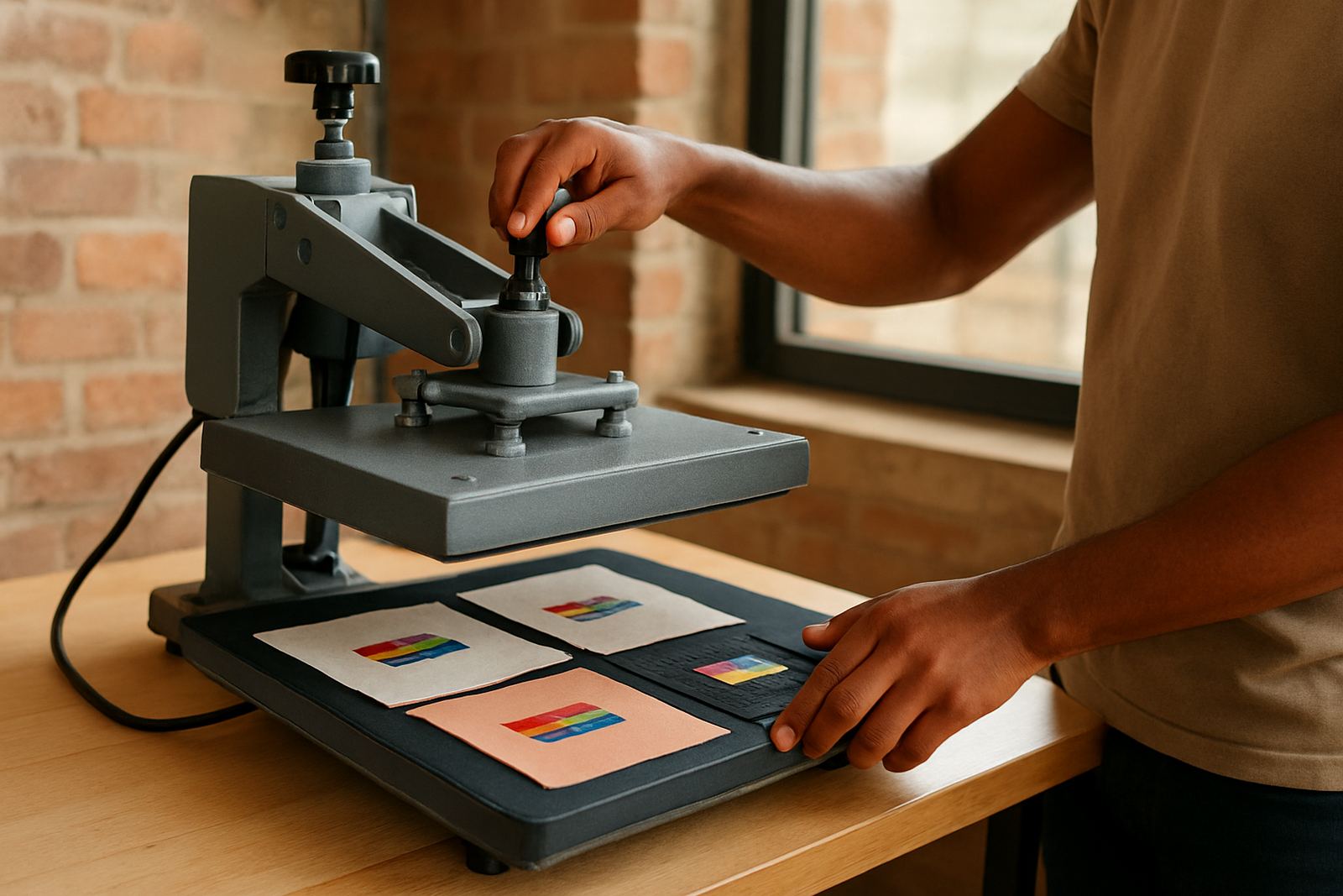
Bright colour on dark garments depends on accurate heat control. If the press is too cool, the image may sit on the surface without full bonding. If it is too hot, the garment can mark, shrink or distort, and polyester may show unwanted shine. Pressure matters as well. Too much pressure can flatten the fibres and change the look of the print, while too little can leave weak adhesion on corners and fine detail.
Load-shedding makes this even more important. When heaters cool down between jobs, production teams should allow the machine to stabilise before running the next batch. In Midrand, where many print shops work through mixed day and night shifts, that small habit can prevent a stack of poor prints. A simple start-up check saves more time than reprinting a full order later.
- Warm up equipment fully before the first production run
- Confirm temperature with an external check if needed
- Keep a log of dwell time, pressure and cure results
- Let garments cool flat before final packing
Artwork Choices That Help Colour Stand Out
Even the best machine will struggle if the artwork is not prepared for dark fabric. Small pastel details, thin outlines and low-contrast gradients can disappear once printed on black or navy. Stronger shapes, cleaner separations and a deliberate colour palette usually work better. White text can look sharp, but it must be edged properly to avoid a grey or fuzzy finish.
For labels, left-chest logos and back prints, think about scale. A design that is fine on a white page may need to be enlarged slightly so that detail survives the garment texture. On sportswear, avoid building a design around very dark blues or browns unless the brief allows for a muted look. If the customer wants bright impact, say so early and show a sample on a similar garment.
A Midrand Example From Short-Run Work
A print shop in Midrand recently took a 48-piece order for black polo shirts for a security team working between Sandton and Pretoria. The client wanted a bright logo on the left chest and a back ID mark that could be read from a distance. The first sample looked dull because the underbase was too light and the curing cycle was rushed to keep up with other work. After adjusting the media profile, increasing the first layer density and allowing a proper press cycle, the second sample held the colour far better.
That job is typical of short-run colour work. The order size is small, but the expectations are high and there is no room for guesswork. Shops serving Gauteng and the neighbouring countries often need that repeatable setup for staffwear, school trips, conferences and event merchandise. It is not just about making colour pop once, it is about making it repeat across the full run.
- Test on the same garment colour before full production
- Keep one approved sample for future repeat orders
- Record the exact press settings and media used
- Check for wash performance before delivery
Keep the Workflow Ready for Repeats
Dark garment work gets easier when the workflow is treated as a repeatable system. Clean screens, stable ink or toner supply, well maintained heaters and calibrated colour all help the next job match the last one. That matters for garment decorators who handle mixed orders from Sandton, Pretoria, the East Rand and further afield into Southern Africa.
Preventive maintenance also counts. Dust, worn rollers, dirty platens and uneven pressure can all affect colour brightness on dark fabric. If the equipment is serviced regularly and the operator knows how the material behaves, the shop can keep turnaround times tight without sacrificing print quality. That is the difference between a one-off result and a reliable production line.